Mapping and visualization > Symbolizing data > Applying symbology
About symbolizing data to represent quantity |
|
|
Release 9.3
Last modified September 15, 2008 |


Print all topics in : "Applying symbology" |
When you want your map to communicate how much of something there is, you need to draw features using a quantitative measure. This measure might be a count; a ratio, such as a percentage; or a rank, such as high, medium, or low. There are several methods with which you can represent quantity on a map—colors, graduated symbols, proportional symbols, dot densities, and charts.
Represent quantity using colors
You can represent quantities on a map by varying colors, as in a choropleth map. For example, you might use darker shades of blue to represent higher rainfall amounts.
When you draw features with graduated colors, the quantitative values are grouped into classes and each class is identified by a particular color.
You may want to take advantage of a color ramp to symbolize your data.
Learn about color ramps
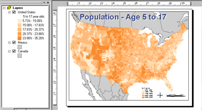
Example graduated color map
A population map, for example, could use different shades of color—in a graduated color ramp—to represent different numbers of people. Darker shades could indicate a greater number of people.
Represent quantity using symbol sizes
You can represent quantities on a map by varying the symbol size you use to draw features. For example, you might use larger circles to represent cities with larger populations.
When you draw features with graduated symbols, the quantitative values are grouped into classes. Within a class, all features are drawn with the same symbol. You can't discern the value of individual features; you can only tell that its value is within a certain range.
Proportional symbols represent data values more precisely. The size of a proportional symbol reflects the actual data value. For example, you might map earthquakes using proportional circles, where the radius of the circle is proportional to the magnitude of the quake.
The difficulty with proportional symbols arises when you have too many values; the differences between symbols may become indistinguishable. In addition, the symbols for high values can become so large as to obscure other symbols.
The image below shows an example of how proportional symbols appear on your map when the background is yellow with a black outline and the symbol is blue with a black outline.
The image below is an example of how proportional symbols appear in the legend and table of contents (as a stack of progressively larger blue circles).

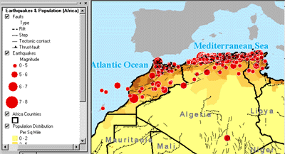
Example graduated symbol map
Like graduated color maps, graduated symbol maps are most useful for showing the rank or progression of values. However, instead of using color to represent the differences in values, the size of the symbol varies.
This map uses a larger symbol to represent earthquakes of larger magnitude.
Represent quantity using dot densities
Another method of representing quantities is with a dot density map. You can use a dot density map to show the amount of an attribute within an area. Each dot represents a specified number of features, for example, 1,000 people or 10 burglaries within an area.
Dot density maps show density graphically rather than showing density value. The dots are distributed randomly within each area; they don't represent actual feature locations. The closer together the dots are, the higher the density of features in that area. Using a dot density map is similar to symbolizing with graduated colors, but instead of the quantity being shown with color, it is shown by the density of dots within an area.
When creating a dot density map, you specify how many features each dot represents and how big the dots are. You may need to try several combinations of dot value and dot size to see which one best shows the pattern. In general, you should choose value and size combinations that ensure the dots are not so close as to form solid areas that obscure the patterns or so far apart as to make the variations in density hard to see.
In most cases, you'll only map one field using dot density maps. In special cases, you may want to compare distributions of different types and may choose to map two or three fields. When you do this, you should use different colors to distinguish between the attributes.
You have two options for placing dots within an area. Non-fixed Placement, the default option, indicates that the dots will be placed randomly each time the map is refreshed, while Fixed Placement freezes the placement of dots, even if the map is refreshed.
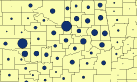
The image below shows how a dot density map appears if the dots are black and the background has a gray county boundary outline and a sand background.

The image below shows how dot density appears in the legend and table of contents.
![]()
Example density map
This map shows where the highest concentration of crimes occurs in a city. Specifically, each dot on the map might represent two incidents of crime. Using this map, the city may choose to increase the number of police patrols in the areas of high density.

Represent quantity using charts
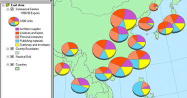
Bar/Column charts, stacked bar charts, and pie charts can present large amounts of quantitative data in an eye-catching fashion. Generally, you'll draw a layer with charts when your layer has a number of related numeric attributes that you want to compare. Use pie charts when you want to show the relationship of individual parts to the whole. For example, if you are mapping population by county, you can use a pie chart to show the percentage of the population by age for each county. Use bar/column charts to show relative amounts rather than a proportion of a total. Use stacked charts to show relative amounts as well as the relationship of parts to the whole.
When you symbolize a layer with charts, a chart symbol and a number are placed in the table of contents under the layer’s name. The number next to the chart symbol represents the attribute value for a chart symbol of that size on the map. For example, a value of five means a chart on the map that is the same size as the chart in the table of contents represents 5 data units. Similarly, a chart on the map that is twice as big as the chart in the table of contents represents 10 data units. The chart symbol and value in the table of contents also appear in the legend.
For bar/column charts, the value refers to the highest bar in the bar/column chart symbol. With stacked or pie charts, it refers to the sum of all fields being represented by the stacked or pie chart symbol.
Example chart map
Chart maps allow you to symbolize multiple attributes on one map as well as communicate the relationship among different attributes. Chart maps display charts—bar and pie charts—over features. This map shows you the volume and type of goods distributed by an exporter throughout Asia.