Data support in ArcGIS > Raster data > Raster display and visualization
Displaying rasters |
|
|
Release 9.2
Last modified September 22, 2008 |


Print all topics in : "Raster display and visualization" |
About displaying rasters
Raster datasets can be displayed, or rendered, in your map in many different ways. Rendering involves the process of displaying your data visually. How a raster dataset is rendered depends on what type of data it contains and what you want to show. Some rasters have a predefined color scheme—a color map—that ArcMap automatically uses to display them. For those that don't, ArcMap chooses an appropriate display method that you can adjust as needed.
You can change display colors, group data values into classes, or stretch values to increase the visual contrast. For multiband rasters, you can display three bands together as a red, green, abd blue (RGB) composite. If you have a raster dataset digital elevation model (DEM), you can choose to display it with hillshading.
When a raster dataset layer is added to ArcMap, it will be displayed using the default renderer, that is most appropriate for the raster dataset layer. Generally, there are particular ways to display a raster dataset to take advantage of all its data. ArcMap allows you to choose from different drawing methods based on your display and analysis needs. Both individual raster datasets and raster catalogs provide similar display methods. You can save a raster layer to preserve the rendered properties of the raster.
Methods of rendering raster data
When a raster dataset is displayed or previewed and a layer is created for a raster dataset, it is drawn using the default renderer that is most appropriate for the raster dataset. You can also choose which renderer you want to use for your data on the Symbology tab of the Layer Properties dialog box. The renderers available are:
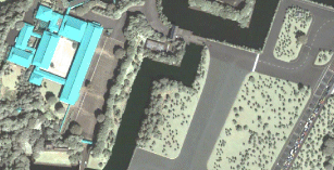
- Stretched—The Stretched renderer displays continuous raster cell values across a gradual ramp of colors. Use the Stretched renderer when you want to draw a single band of continuous data. The Stretched renderer works well when you have a large range of values that you want to display, such as in spectral imagery, aerial photographs, or elevation models. Below is an example of the Stretched renderer on a single band in a multiband raster dataset.
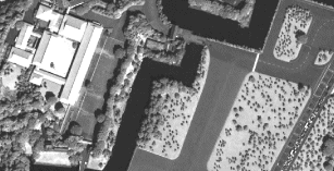
- RGB Composite—Use RGB Composite for a multiband raster layer. You can draw a three-band composite of raster data with the option of displaying fewer than three bands or changing the band combination. Below is an example of a multiband raster dataset displayed using three bands.
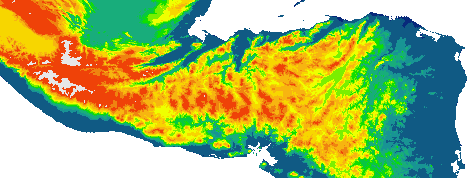
- Classified—The Classified renderer is used with a single-band raster layer. The Classified method displays thematic rasters by grouping cell values into classes. It is typical to use this type of thematic classification on continuous phenomena, such as slope, distance, or suitability, where you want to classify the range into a small number of classes and assign colors to those classes. Below is an example of an elevation raster dataset displayed using the Classified renderer.
- Manual—Lets you set the class breaks. Use this choice if, for example, you want to emphasize particular patterns by placing breaks at important threshold values or if you need to comply with a particular standard that demands certain class breaks.
- Equal Interval—The range of cell values is divided into equally sized classes where you specify the number of classes. Use this method to emphasize the relative amount of attribute values compared to other values. It is best applied to familiar data ranges such as percentages and temperature.
- Defined Interval—You specify an interval to divide the range of cell values, and ArcMap determines the number of classes.
- Quantile—Each class contains an equal number of cells. Use this method with linearly distributed data.
- Natural Breaks (Jenks)—The class breaks are determined statistically by finding adjacent feature pairs between which there is a relatively large difference in data value.
- Standard Deviation—Shows you the amount a cell’s value varies from the mean.
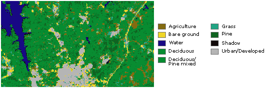
- Unique Values—Use Unique Values when you want each value in the raster layer to be displayed individually. For instance, you may have discrete categories representing particular objects on the earth’s surface, such as those in a thematic raster layer, which could display soil types or land use. Below is an example of a classified raster dataset showing land use.
- Colormap—You use the Colormap renderer as you would the Unique Values renderer. However, you use the Colormap renderer when you choose to have the values in the raster layer represented by a prespecified color.
The Colormap renderer displays automatically in the list of available renderers on the Symbology tab.
You can choose from several different automatic stretches and a manual option when deciding exactly how to stretch the values.
The first example below uses the RGB Composite renderer, and the bottom image uses the Stretched renderer on one of the bands.
You can choose a manual classification method or one of these standard methods:
The Unique Values renderer displays each value as a random color. If your data has a color map, you can use the Colormap renderer to display your data with assigned colors.
Rendering single-band datasets
When a single-band raster dataset is drawn, the rules for determining the default renderer are as follows:
- If your dataset has a color map, it will be displayed with the Colormap renderer using the colors stored in the color map.
- If your dataset contains 1-bit data and the dataset does not have pyramids, the Unique Values renderer will be used with zero set to white and one set to black. When 1-bit data has pyramids, the Stretched renderer will be used. Pyramid files for 1-bit data are created as 8-bit grayscale to achieve improved display when viewing the raster at its full extent.
- If your dataset contains less than, or equal to, 25 unique values, the Unique Values renderer will be used with random colors assigned to the values.
- If your dataset has an internally stored custom stretch, the Stretched renderer will be used with a color ramp from black to white.
- If your dataset has statistics, the Stretched renderer will be used with a color ramp from black to white and a two standard deviation stretch. If there are no statistics for your dataset, the Stretched renderer with a color ramp from black to white will still be used, but the values won't be stretched.
Rendering multiband datasets
When a multiband raster dataset is drawn using a default RGB composite renderer, it uses the default band combination defined on the Raster tab of the Options dialog box. If your dataset has statistics, a two standard deviation stretch will be used. If your dataset does not have statistics, no stretch will be applied and the minimum and maximum values of the data will be scaled to 0 and 255.
Rendering raster catalogs
A raster catalog is a collection of raster datasets defined in table format in which the records define the individual rasters that are included in the catalog. A raster catalog can be used to display a collection of adjacent rasters without having to mosaic them into a single large file. Raster catalogs can also be used to hold disparate, semioverlapping, or fully overlapping raster datasets.
By default, raster catalogs are displayed as a wireframe if more than nine images are in the current display extent. Otherwise, the actual raster data will be displayed. The use of the wireframe speeds up the display of raster catalogs. The default of nine images can be changed in the display properties of your raster catalog or on the Raster tab on the Options dialog box.
ArcMap has the ability to render each raster dataset member of a geodatabase raster catalog with its most appropriate renderer. The Symbology tab of a raster catalog’s Layer Properties dialog box lists the renderers that are available for the catalog. This list of renderers can be edited to add or remove various renderers. Only the renderers in the list can be used in the rendering of the catalog. In the available renderers list, ArcMap places an asterisk next to each of the renderers that are currently active and are applied to one or more raster dataset members of the raster catalog. However, the active list can only be triggered when an image is displayed on the screen. This list will not be complete until the entire catalog has been viewed. The active renderers persist even after you change the display to another area, to the full extent, or back to a wireframe display.
See the steps to change the raster catalog renderer
Hillshading raster datasets
Applying hillshading to a raster dataset allows you to visualize the terrain of the surfaces that is represented by your raster dataset. There are two ways to display hillshading with your raster dataset. The first is using the Hillshade effect renderer, which is available within the Stretched renderer. The Hillshade renderer will predict where shadows exist in the DEM, depending on the origin (direction) of the light source and the elevations that exist. The hillshade lighting can be adjusted by opening the Data Frame Properties dialog box that contains the raster dataset layer and adjusting the controls on the Illumination tab.
To persist the hillshade effect to a raster dataset, you will need to use the ArcGIS Spatial Analyst or 3D Analyst extension, which is the second way to view a hillshaded raster dataset. If you have one of these extensions, you can use either the Hillshade command on the pull-down menu on that extension's toolbar in ArcMap or the Hillshade tool in that extension's toolbox in ArcToolbox.
If you have 3D Analyst, see Producing a hillshade in 3D Analyst to learn more about hillshading.
If you have ArcGIS Spatial Analyst, see Producing a hillshade to learn more about hillshading.
You may also be interested in learning how to show hillshading by drawing TINs as surfaces.
How to display rasters
Drawing a multiband raster dataset as an RGB composite
- In the table of contents, right-click the raster layer that you want to draw as an RGB Composite and click Properties.
- Click the Symbology tab.
- Click RGB Composite.
- Click the Band drop-down arrow next to each color and click the band you want to display for that color.
- Optionally, click the Stretch Type drop-down arrow and click the stretch you want to apply.
- Optionally, click Histogram to modify the stretch settings.
- If the raster contains a background or border around the data that you want to hide, check Display Background Value and set the color to No Color.
The cells will display transparently. - Click OK.
| Tips |
|
Drawing thematic raster datasets representing unique categories such as land use
- In the table of contents, right-click the raster layer that you want to draw showing unique values and click Properties.
- Click the Symbology tab.
- Click Unique Values.
- Click the Value Field drop-down arrow and click the field you want to map.
- Click the Color Scheme drop-down arrow and click a color scheme.
- Optionally, click a label and type in a different description.
- Optionally, select a color or No Color to display any NoData values.
- Click OK.
| Tips |
|
Drawing a continuous raster dataset such as an orthophoto
- In the table of contents, right-click the raster layer that you want to display across a color ramp and click Properties.
- Click the Symbology tab.
- Click Stretched.
- Optionally, if your raster dataset has multiple bands, choose the band you want to stretch.
- Optionally, click the Label boxes and type labels for the table of contents.
- Click the Color Ramp drop-down arrow and click a color ramp.
- Optionally, choose a color or No Color to display any NoData values.
- Optionally, click the Stretch drop-down arrow and click the type of Stretch, if any, you want to perform.
- Optionally, scroll down and click Statistics to change the statistics.
- Click OK.
| Tips |
|
Drawing thematic raster datasets representing continuous data such as elevation
- In the table of contents, right-click the single-band raster dataset layer that you want to display by grouping values into classes and click Properties.
- Click the Symbology tab.
- Click Classified.
- Click the Value drop-down arrow and click the field you want to map. If your raster dataset does not have a table, the Value drop-down arrow is unavailable.
- Optionally, click the Normalization drop-down arrow and click a field to normalize your data.
- Click the Classes drop-down arrow and click the number of classes you want.
- Click Classify and choose the classification method you want to use. Click OK.
- Click OK.
- Click the Color Ramp drop-down arrow and click a color ramp.
- Optionally, choose a color or No Color to display any NoData values.
- Click OK.
| Tips |
|
Drawing thematic raster datasets that represent categories using a color map
- In the table of contents, right-click the raster layer that you want to draw with a color map and click Properties.
- Click the Symbology tab.
- Click Colormap.
- Click OK.
| Tips |
|
Changing the raster catalog renderer
There is often more than one renderer listed in the Available list. ArcMap places an asterisk next to each of the renderers that are currently active and are applied to one or more raster dataset members of the raster catalog.
To make sure that only a single renderer is used to display all your raster datasets:
- Right click the raster catalog layer in ArcMap and click Properties.
- Click the Symbology tab.
- Click the renderer in the Available list that you want to remove.
- Click the Remove button located below this list.
- Right click the raster catalog layer in ArcMap and click Properties.
- Click the Symbology tab.
- Click the Add button below the Available list.
This opens up the Add Renderer dialog box. - Click the renderer you wish to use, such as Unique Values and click Add.
- Click Dismiss to close the dialog box.
- Click any remaining renderer and click the Remove button until only the renderer you want remains in the list.
- When using the Unique Values or Classified renderers, click Load Values, because you need to calculate all the values.
This opens the Calculate dialog box. - Click Calculate. Once completed, Click Add, then click Close.
Displaying a time series raster catalog
- Right-click the raster catalog layer in the table of contents and click Properties.
- Click the Display tab.
- Click Never show wireframe.
- Check Redraw whole display after each raster draw.
- Type a Delay draw value in milliseconds in the text box.
- Optionally, choose a field in the Order By drop-down list. If an order field is selected, choose whether to have the raster items in ascending or descending order.
- Click OK.
| Tip |
|
Displaying a DEM with hillshading
Enable the Hillshade Effect renderer
- Click the Add Data button
 to add a DEM to ArcMap.
- Right-click the layer in the table of contents and click Properties.
- Click the Symbology tab.
- Click Stretched in the Show list to choose the Stretched renderer.
- Check Use hillshade effect.
- Optionally, adjust the z-value to add a vertical exaggeration.
- Click OK.
Changing the illumination angle of the hillshade effect
- Right-click the data frame containing the DEM layer and click Data Frame Properties.
- Click the Illumination tab.
- Adjust the Azimuth angle.
- Adjust the Altitude angle.
- Optionally, you can adjust the contrast of the hillshading.
- Click Apply to see the changes.
Click OK to close the Data Frame Properties dialog box.
Editing the color ramp
You can edit the color ramps for any of the renderers that use one, such as Stretched or Classified.
- Right-click on the color ramp and click Properties.
This opens the Edit Color Ramp dialog box used throughout ArcGIS Desktop. To learn about using the Edit Color Ramp dialog box, see Working with color ramps.