Mapping and visualization > Symbolizing data > Applying symbology
Drawing features to show categories |
|
|
Release 9.2
Last modified August 15, 2007 |


Print all topics in : "Applying symbology" |
About categorizing features
A category describes a set of features with the same attribute value. For example, given parcel data with an attribute describing land use, such as residential, commercial, and public areas, you can use a different symbol to represent each land use. Drawing features this way allows you to map features and to which category they belong. This can be useful if you're targeting a specific type of feature for an action or policy. For instance, a city planner might use the land-use map to target areas for redevelopment.
In general, look for these kinds of attributes when mapping by category or unique value:
- Attributes describing the name, type, or condition of a feature
- Attributes that uniquely identify features (for example, a county name attribute could be used to draw each county with a unique color.)
You can let ArcMap assign a symbol to each unique value based on a color scheme you choose, or you can explicitly assign a specific symbol to a specific attribute value.
To draw features with specific symbols based on attribute values, you need to create a style that contains symbols named after the attribute value they represent. For example, if you have a dataset that categorizes roads as either major or minor, then you need to have line symbols within that style named major and minor. ArcMap will match the attribute value to the line symbol name to draw the feature. Features that don't have a matching line symbol won't be drawn. This way of drawing features is especially useful if you want to draw your data the same way on different maps.
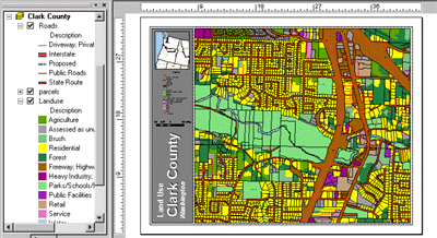
Example unique values map
On a unique values map, you draw features based on an attribute value, or characteristic, that identifies them. For example, on a land-use map, each land-use type could be drawn with a specific color.
Combining categories
If you're drawing features by category, the number of categories you display will affect what patterns are revealed on the map. Most people can discern between five and seven categories for a given layer. The more advanced the audience, the more categories it will be able to identify and the more easily it can interpret complex patterns. Conversely, a less advanced audience may benefit more from a map with fewer categories.
When displaying your data, you can control how you organize and display categories for a layer. If you want to display fewer categories, you can combine similar categories into one category to help make the patterns more apparent, for example, combine two detailed land-use categories into a more general one. However, the trade-off is that some information will be lost.
Organizing categories
Instead of reducing the number of categories, you might want to organize individual categories into defined groups. This allows you to work with and view them as a group. In addition, a map reader will see the groups listed in the table of contents.
You can also organize your unique values by adding headings. For example, if you were working with a land-use dataset, you could create a set of broad land-use category headings and organize similar categories of values into them. You might have a heading of commercial and include land uses such as light industry, heavy industry, and retail within that heading. Headings appear in the legend and in the table of contents.
How to draw features in categories and manage categories
Drawing a layer showing unique values
- Right-click the layer you want to draw showing unique values in the table of contents and click Properties.
- Click the Symbology tab and click Categories.
ArcMap automatically selects the Unique values option. - Click the Value Field drop-down arrow and click the field that contains the values you want to map.
- Click the Color Scheme drop-down arrow and click a color scheme.
- Click Add All Values.
This adds all unique values to the list. Alternatively, click the Add Values button to choose which unique values to display. - Click a label in the Label column and type the label you want if you want to edit the default label so more descriptive labels appear in your legend and the table of contents.
- Click OK.
| Tip |
|
Drawing features by referencing specific symbols in a style
- Right-click the layer you want to draw showing unique values in the table of contents and click Properties.
- Click the Symbology tab.
- Click Categories.
- Click Match to symbols in a style.
- Click the Value Field drop-down arrow and click the field that contains the values you want to map.
- Click the Match to symbols in a style drop-down arrow and click the style that contains symbol names that match attribute values.
If the style you want is not displayed in the list, click Browse to search for it on disk. - Click Match Symbols.
This adds all unique values that have a matching symbol in the style. Alternatively, click the Add Values button to choose which unique values to display. - Click a label in the Label column and type the label you want if you want more descriptive labels to appear in the legend and the table of contents.
- Click OK.
| Tip |
|
Sorting the unique values
- Right-click the layer whose unique values you want to sort in the table of contents and click Properties.
- Click the Symbology tab.
- Click the Value column to show a context menu.
- Click Reverse Sorting to reverse the alphanumeric sorting of the entire list of classes.
- Click OK.
Ordering unique values
- Right-click the layer whose unique values you want to reorder in the table of contents and click Properties.
- Click the Symbology tab.
- Click the value you want to move up or down in the list.
- Use the up and down arrows to either promote or demote the value in the list.
- Click OK.
| Tip |
|
Combining two or more categories into one
- Right-click the layer drawn with unique values for which you want to combine categories in the table of contents and click Properties.
- Click the Symbology tab.
If you don't already see categories in the scrolling list, follow the steps for drawing a layer showing unique values. - Click the first of the values you want to combine. Hold down the Shift or Ctrl key and click the additional values that you want to combine.
- Right-click the values and click Group Values.
The selected values will now be combined into one category. - Click a label in the Label column and type the label you want if you want more descriptive labels to appear in your legend and the table of contents.
- Click OK.
Ungrouping combined categories
- Right-click the layer drawn to combine categories in the table of contents and click Properties.
- Right-click a combined category in the scrolling list.
- Click Ungroup Values.
| Tip |
|
Organizing categories in headings
- Right-click the layer drawn with unique values for which you want to organize categories into groups in the table of contents and click Properties.
- Click the Symbology tab.
If you don't already see categories in the scrolling list, follow the steps for drawing a layer showing unique values. - Click the first value you want to move to a new heading. Hold down the Shift or Ctrl key and click the additional values that you want to move to that heading.
- Right-click a selected value, point to Move to Heading, then click New Heading.
- Type a name for the new heading and click OK.
- Click OK on the Layer Properties dialog box.
A new heading now appears in the table of contents with values grouped in it.
| Tips |
|