Mapping and visualization > An overview of mapping and visualization
Map layers |
|
|
Release 9.3
Last modified July 28, 2009 |


Print all topics in : "An overview of mapping and visualization" |
When you add a dataset to ArcMap, a layer is created. Each map layer is used to display and work with a specific GIS dataset. A layer represents geographic data in ArcMap such as a particular theme of data. Example map layers include streams and lakes, terrain, roads, political boundaries, parcels, building footprints, utility lines, and orthophoto imagery.
A layer references the data stored in geodatabases, coverages, shapefiles, rasters, and so on, rather than actually storing the geographic data. Thus, a layer always reflects the most up-to-date information in your database. A layer won't draw on your map unless you also have access to the data source on which the layer is based.
Layers have a number of properties you can work with and set. You can right-click a layer in the table of contents and click Properties to view the Layer Properties dialog box, where you can set symbology, labeling, drawing rules, and other options. For example, you can specify that streams are drawn with all blue lines, parcels are drawn based on their land-use code, parks are drawn using a green pattern fill and are labeled with the park name, digital elevation is portrayed as a shaded relief, and so on. In addition, other properties include defining the scales at which they can draw, which features to draw from the data source, where that data is located in your database, attribute properties, joins, and relates for working with the tabular information.
Layers can be saved to a file on disk (.lyr) so they can be shared and reused without sharing the entire map. When you save a layer to disk, you save everything about the layer, such as the symbolization and labeling. When you add a layer file to another map, it will draw exactly as it was saved. Others can drop those layers onto their maps without having to know how to access the database or classify the data; this can be helpful when sharing data stored in a multiuser geodatabase with nontechnical staff members. You can share layers over the network as well as e-mail layers, along with the data, to people or enclose the layer within the data's metadata.
Symbolizing data in a layer
When you add a dataset to a data frame in your map, by default ArcMap draws all the features using the same symbol and color. If you open the properties of a layer and click the Symbology tab, you can change the way that information is drawn. Depending on the type of layer that is created, you will find different ways to symbolize the data contained within the layer. Most often, information contained within the dataset itself is used to determine how the data is symbolized.
Sometimes all the features in a dataset are drawn using a common symbol or color. For example, all streams are drawn using blue lines and labeled in the same font and size.
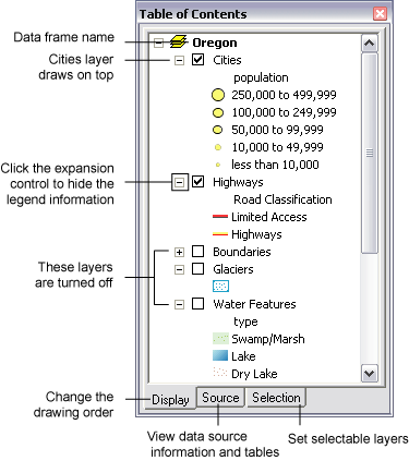
However, chances are that you will often want some layer displays to be more sophisticated and will want to assign symbols based on attribute values. For example, the circle symbols representing cities in the map below are classified into sizes based on population.
Categorical data such as this is drawn using unique symbols for each category. You can work with continuous numeric data fields by using classification tools to create a series of class ranges. Then, you can assign symbols to draw each class or use a color ramp to assign color values to each class.
ArcMap contains numerous alternative methods for depicting and rendering map symbols and displays. Learning about various alternatives for layer rendering and portrayal is important for effective use of ArcMap.
Here are examples of three frequently used methods for symbolizing layers.
Displaying quantities using a classification scheme
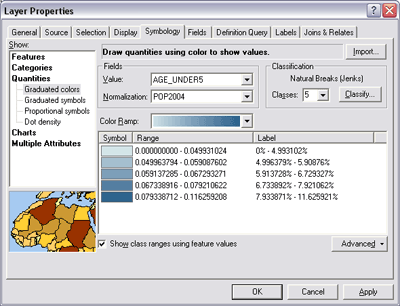
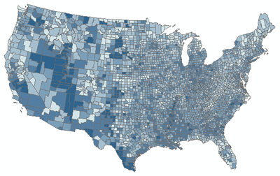
Many numerical attribute values can reflect a range of measurements—for example, population density, percentages, measures of rainfall, and so on. Such values can be classified into ranges of values, and each class can be assigned a map symbol for display purposes. You can choose to symbolize quantities with graduated colors or symbols, proportional symbols, or dots. When you specify the attribute value to use, a default classification is assigned. You can modify the classification scheme, the number of ranges, and the class breaks.
Once you have classified your data, you can use various rendering methods to depict the classes in your map. The example below shows a choropleth map of population density (percentage of the population under age five, by U.S. county), drawn using graduated colors. Once you pick the renderer, you can choose a color ramp from the drop-down menu or specify the color of an individual class by double-clicking it to display the Symbol Selector dialog box.
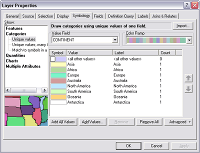
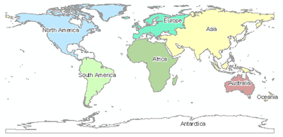
Displaying categorical data using unique symbols
Assigning unique symbols for each category can be based on a class attribute value. A value from a series of classes or categories could be assigned to each feature. For example, roads or parcels can be drawn based on their assigned class value (category).
A unique symbol is assigned to each category—features with a matching category value are drawn using an assigned symbol. For example, a color scheme may be used to assign a unique color to each attribute category as shown below. This example shows the boundaries for the continents of the world, each drawn with a different color.
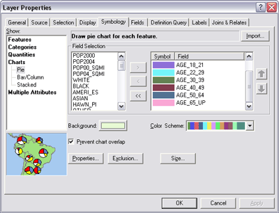
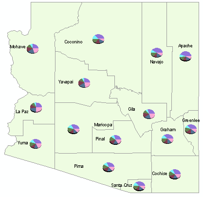
Combining quantities and categories using chart mapping
Symbolizing each feature with a chart is a way of showing categories and quantities simultaneously. You essentially create categories from related fields that contain quantities. For example, a dataset of counties might have fields for age groups—under 21, 22 to 29, 30 to 39, 40 to 49, and so on—containing the number of people in each group. You could use these fields as categories to create charts showing the relative number of people in each age group for each county.
Creating text from layers
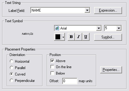
Layers are used to create map labels using attribute values. You can specify a field that can be used as the source for label text and specify a series of drawing rules for the labels. In this case, administrative boundaries will be labeled using their name taken from the NAME field.
Learn more about text in ArcGIS
Layers in the table of contents
The table of contents lets you specify which layers are displayed on the map (by turning them on and off). In addition, the order of layers in the table of contents determines the drawing order of layers on the map—layers higher in the table of contents are drawn on top of those that are lower. To change the order, click the table of contents Display tab, click and hold a layer name, and drag it up or down in the table of contents to a new position.
Layers with complete coverage of the area, such as filled polygons or a raster, are usually drawn underneath other map layers.
Learn more about layer drawing order
Learn more about using the table of contents
Working with layer attributes
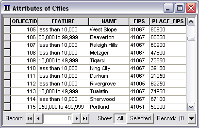
You can work with attribute tables for the datasets referenced by each map layer. Right-click a layer in the table of contents to open its attribute table. In the table window, you can perform queries, make selections, zoom and pan to features on the map, and so on. Click the table window's Options menu to create graphs and reports, change the font for the table, print the table, and perform various other operations. When you select an item in a table or graph, the feature is also selected on the map (and vice versa).
Before you begin to work with a layer's attribute table, you can first set various display properties for tables. You do this by clicking the Fields tab on the Layer Properties dialog box to specify which fields will appear when you open the layer's table, what the fields will be named (using alias names), and how numeric fields will be formatted. You can also specify these options for an individual field by right-clicking a field heading in the table window and clicking Properties.
Joins and relates between layers and attribute tables
Related data is often gathered and stored in multiple layers and tables. Some examples of related data stored in different layers and tables include
- A Parcel layer and an Owner table that contain information about the parcel owners.
- A States layer and a County layer that contain census data by county for each state.
- A Utility Pole layer and a Transformer layer that list all the transformers mounted on each utility pole.
Even though the data is stored in different layers and tables, you will often need to identify related data to perform queries and editing related data. ArcMap provides three methods to associate related data: relates, joins, and spatial joins.
-
Relate: A relate defines a relationship between two attribute tables using a key common to both tables. Relates allow you to access related data when you work with a layer's attributes. A relate is similar to a simple relationship class except it can involve data from different workspaces (for example, a dBASE table can be related to a coverage) and is stored in a layer file or ArcMap document.
Learn more about relates
-
Join: When you join two tables, you append the attributes from one table onto the other based on a field common to both. Joins are primarily used to label and symbolize your layer based on the associated data.
Learn more about joins
-
Spatial join: When the layers on your map don't share a common attribute field, you can join them using a spatial join. This joins the attributes of two layers based on the location of the features in the layers. Spatial joins are different from attribute joins in that they are not dynamic and require the results to be saved to a new output layer.
Learn more about spatial joins
Different types of layers
There are different kinds of layers. Some layers represent a particular type of geographic feature, while others represent a particular type of data. Each layer type has different mechanisms for displaying and symbolizing its contents, and specific operations that you will perform against them. Many layers have special sets of tools for working with the layer and its contents. For example, you can use the Editor toolbar to manipulate feature layers, the Topology toolbar to work with the contents of a topology layer, and the Annotation toolbar to create and edit annotation (text) layers.
Here are a few of the common layer types:
-
Feature layer: Alayer that references a set of feature (vector) data that represents geographic entities as points, lines, and polygons. A feature layer's data source can be stored in geodatabases, shapefiles, ArcInfo Coverages, CAD files, and so on.
-
Raster layer: A layer that references a raster or image as its data source.
- Graphics layer: a layer used to display graphics, text, and annotation—typically on top of other map layers.
-
Service layer: A layer used to display ArcIMS, ArcGIS Server, WMS services, and other Web services.
-
Geoprocessing layer: Alayer that displays the output of a geoprocessing tool.
Grouping layers
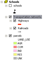
Layers can be placed into groups to combine multiple layers that are often displayed or managed together. Grouping layers can help organize related layers in a map and can be used to define advanced drawing order options. For example, suppose you have two layers on a map representing railroads and highways. You might choose to group these layers together and name the resulting layer Transportation networks (highlighted in the graphic below). When you uncheck Transportation networks in the table of contents, the Highways and Railroads sublayers are also turned off.
Common tasks with layers
| Common task | Where to go for more information |
| Adding data to ArcMap
|
Adding layers to a map |
| Setting layer properties |
Setting layer properties
Displaying layers at certain scales Displaying a subset of features in a layer |
| Referencing data with layers |
Repairing broken data links
Referencing data in the map |
| Saving a layer (.lyr file) | Saving a layer to disk |
| Symbolizing data in a layer |
Drawing all features with a single symbol
Drawing features to show categories Drawing features to show quantities |
| Using feature attributes to create map labels | Displaying labels |
| Specifying the order layers draw in a map |
Changing a layer's drawing order
Using the table of contents |
| Opening a layer's attribute table | Adding and viewing tables in ArcMap |
| Grouping layers | Managing group layers |
| Relating Data | About joining and relating tables |
| Setting HTML display properties for a map layer |
Setting HTML pop-up properties for feature layers
|
| Creating a map layer for delivery using KML | Working with KML in ArcGIS |